Part 1 - Section 1: Modifying Data
Data Visualization is important in order to interpret data and convey your analysis to others. The first step in trying to interpret data is often to visualize it in some way. Data visualization can be as simple as creating a summary table, or it could require generating charts to help interpret, analyze, and learn from the data. Data visualization is very helpful for identifying data errors and reducing the size of your data set by highlighting important relationships and trends.
Effective Design Techniques
Excel is the most commonly used tool in the business world to show basic data visualization. We can store the data in Excel as two separate vectors via the following command:
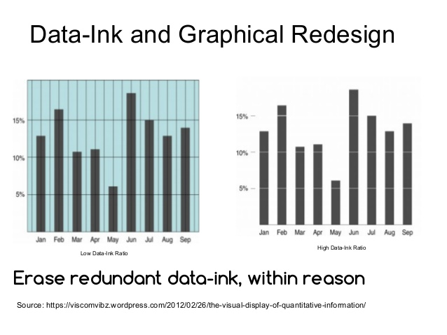
One of the most helpful ideas for effective data visualization is the concept of the data-ink ratio that was introduced by the American statistician and professor emeritus of political science, statistics, and computer science at Yale University Edward Tufte (born in 1942), the expert whose work has contributed significantly to designing effective data presentations, in his 1983 book, The Visual Display of Quantitative Data:
