Part 1 - Section 3: Measures of Location
Usually we deal through a lot of data that may include website performance, sales performance, product adoption, customer service, marketing campaign results ... the list goes on. When you manage multiple content assets, such as social media or a blog, with multiple sources of data, it can get overwhelming. So you need to visualize and analyze the data in such a way that you can quickly extract insights and actionable information. Therefore, you need an efficient tool for this information based on your understanding what types of graphs to use -- and why. It is important to avoid choosing the wrong visual aid or simply defaulting to the most common type of data visualization because it could cause confusion with the viewer or lead to mistaken data interpretation. One of the remedies to this situation is using charts---a great tool for displaying data. There are known the following types of charts:
-
Column Chart is a graphic representation of data. Column charts display vertical bars going across the chart horizontally, with the values axis being displayed on the left side of the chart.

-
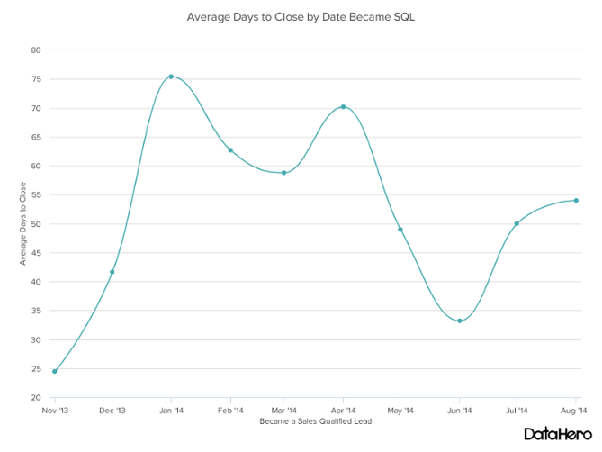
Line Graph is also known as a line chart, is a type of chart used to visualize the value of something over time. For example, a finance department may plot the change in the amount of cash the company has on hand over time. The line graph consists of a horizontal x-axis and a vertical y-axis.
-
Bar Graph (also called Bar Chart) is a graphical display of data using
bars of different heights.

-
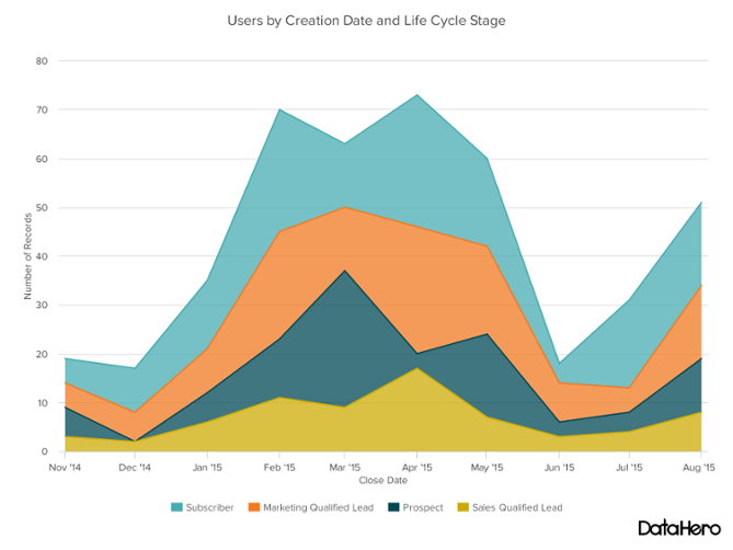
Area Chart displays graphically quantitative data. It is based on the line chart. The area between axis and line are commonly emphasized with colors, textures and hatchings.
-
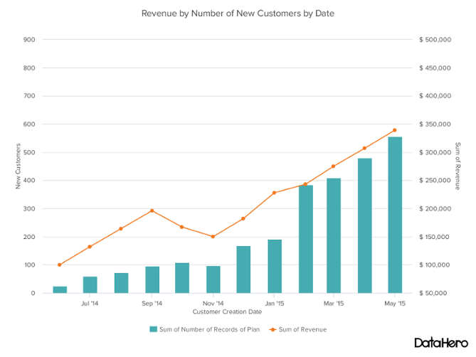
Dual Axis Chart is a great way to easily illustrate the relationship between two different variables. They illustrate a lot of information with limited space and allow you to discover trends you may have otherwise missed if you’re switching between graphs.
-
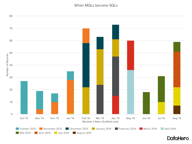
Stacked Bar Graph is a chart that uses bars to show comparisons between categories of data, but with ability to break down and compare parts of a whole. Each bar in the chart represents a whole, and segments in the bar represent different parts or categories of that whole.
-
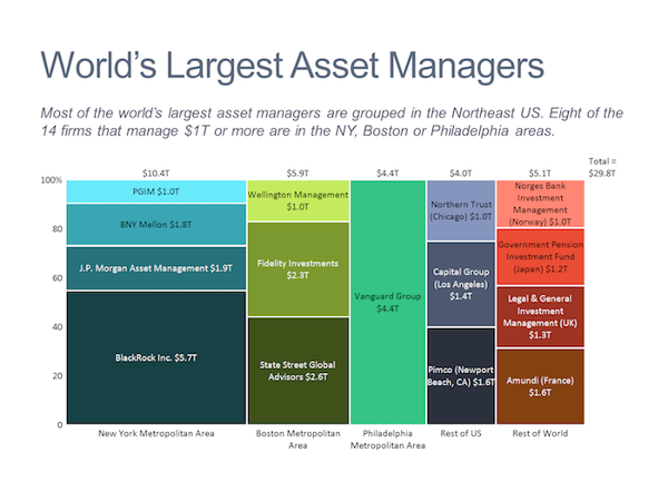
Mekko Chart (sometimes also called marimekko chart) is a two-dimensional stacked chart. In addition to the varying segment heights of a regular stacked chart, a Mekko chart also has varying column widths.
-
Pie Chart is a circular statistical graphic, which is divided into slices to illustrate numerical proportion.

-
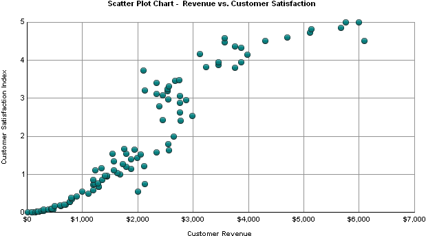
Scatter Plot Chart (also called a scatterplot, scatter
graph, scatter chart, scattergram, or scatter diagram)
is a type of plot or mathematical diagram using Cartesian coordinates to
display values for typically two variables for a set of data. If the points
are color-coded, one additional variable can be displayed.
-
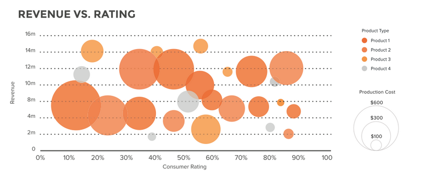
Bubble Chart is a type of chart that displays three dimensions of data.
-
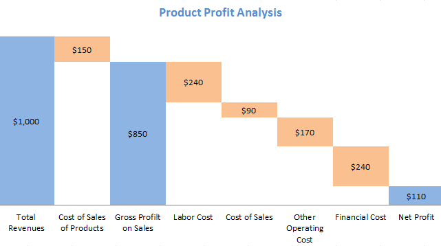
Waterfall Chart is a form of data visualization that helps in understanding the cumulative effect of sequentially introduced positive or negative values. These intermediate values can either be time based or category based. The waterfall chart is also known as a flying bricks chart or Mario chart due to the apparent suspension of columns (bricks) in mid-air. Often in finance, it will be referred to as a bridge.
-
Funnel Chart is often used to represent stages in a sales process[1] and show the amount of potential revenue for each stage. This type of chart can also be useful in identifying potential problem areas in an organization’s sales processes. A funnel chart is similar to a stacked percent bar chart.

-
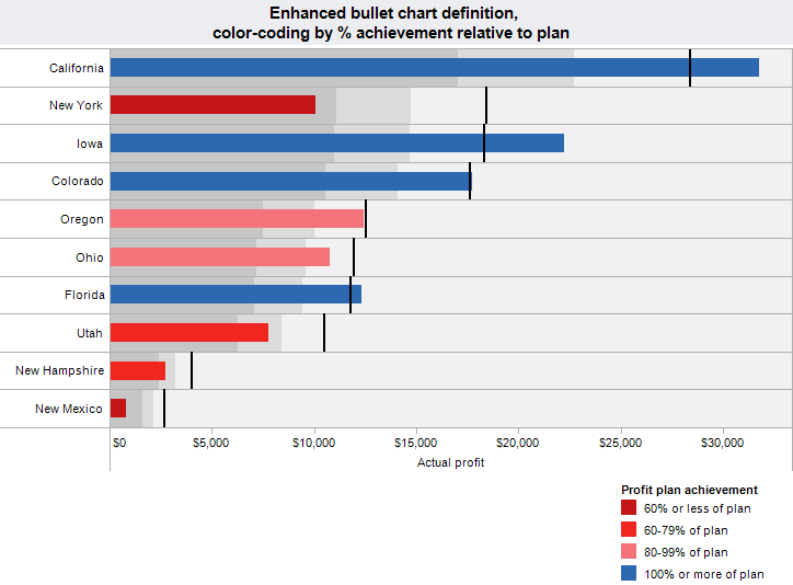
Bullet Chart or Bullet Graph is a variation of the Bar Chart type, developed by Stephen Few. Generally, it is used to display progress toward a certain goal.
-
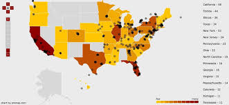
Heat Map is a graphical representation of data where the individual values contained in a matrix are represented as colors. "Heat map" is a newer term but shading matrices have existed for over a century.
