Part 1: Plotting
This tutorial contains many Mathematica scripts. You, as the user, are free to use all codes for your needs, and have the right to distribute this tutorial and refer to this tutorial as long as this tutorial is accredited appropriately. I would like to extend my gratitude to all of the students that aided me in developing this tutorial. The coding, testing, and debugging required a concerted effort, and the following students deserve recognition for their input: Emmet and Jesse Golden-Marx (Fall 2011), Pawel Golyski (Fall 2012). Any comments and/or contributions for this tutorial are welcome; you can send your remarks to <Vladimir_Dobrushkin@brown.edu>
Return to computing page for the second course APMA0330
Return to Mathematica tutorial page for the first course
Return to Mathematica tutorial page for the second course
Return to the main page for the course APMA0330
Return to the main page for the course APMA0340
1.1. Plotting functions
I. Analytic functions
One of the best characteristics of Mathematica is its plotting ability. It is very easy to plot a variety of functions using Mathematica. For a plot, it is necessary to define the independent variable that you are graphing with respect to. Mathematica automatically adjust the range over which you are graphing the function.
Plot[2*Sin[3*x]-2*Cos[x], {x,0,2Pi}]
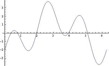
This is a simple Plot command. In this example, we are just plotting a function using Mathematica default capabilities, but it is possible to specify the range with PlotRange command.
Plot[2*Sin[3*x]-2*Cos[x], {x,0,2Pi}, PlotRange -> Automatic]
For multiple plots, use either command Show or you can use {} with commas:
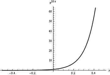
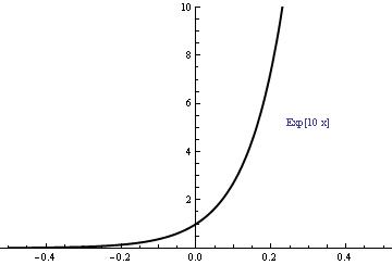
When you need to restrict the vertical range, use PlotRange command as the following example shows.
 |
 |
II. Plotting discontinuous functions
There are two types of discontinuous functions. There are piecewise functions and functions that are discontinuous at a point. A piecewise function is a function defined by different functions for each part of the range of the entire function. A discontinuous function is a function that has a discontinuity at one or more values mainly because of the denominator of a function is being zero at that points. For example, if the denominator is (x-1), the function will have a discontinuity at x=1.
Using Mathematica, it is easy to plot a piecewise discontinuous function.
An example of a Piecewise function is given below. There are three different functions that have been generated in this graph.
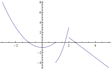
This code is very similar to the Plot command. The only difference is that you add the Piecewise Command and after this command you enter the different components of the piecewise equation and the range for each of these components.
This code creates a graph that shows all three of the different piecewise components over the range of -3 to 5. Piecewise graphing does not create vertical lines at the boundary lines of each of the piecewise components.
Discontinuous Functions can be plotted in Mathematica using the following command sequence.
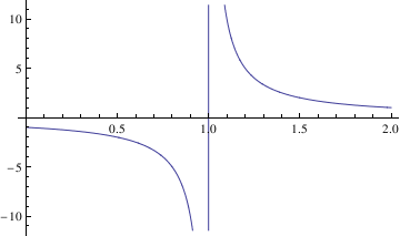
When you are graphing these kinds of functions, often times, it can be useful to generate a vertical or horizontal asymptote. To do this, you can use the following commands: Plot[c,{x,c1,c2}] for horizontal asymptotes. In this command, c is the value of the horizontal asymptote and c1 and c2 are the range of the graph.
It is more difficult to graph a vertical line using Mathematica than a horizontal line. One way to do this is:
Plot[0, {x, 1, 3}, GridLines -> {{2}, None}]
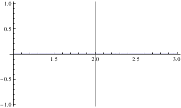
In this command sequence, I am telling Mathematica to graph the image x=2 so I just get the vertical line. The range of this function is 1 to 3. Then the command calls for Mathematica to create a straight vertical gridline at x=2. None is part of the command that tells Mathematica to just make it a straight dark, non dashed line.
Let’s plot a piecewise function:
Function is undefined at the points of discontiuity x=1. For plotting a function with a point discontinuity, Mathematica will generate a vertical line at the point discontinuity to represent that the value at x=1 goes to infinity.
f[t_] := Piecewise[{{t^2, 0 < t < 2}, {4 - t, 2 < t < 4}}, 2]
Plot[f[t], {t, 0, 10}, PlotRange -> Full]
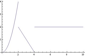
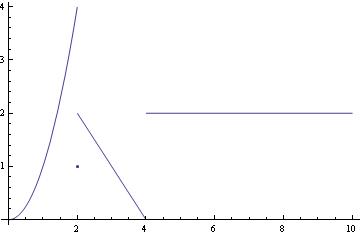
The same function with the value of 1 at t=2:
f[t_] := Piecewise[{{Piecewise[{{t^2, 0 < t < 2}, {1, t == 2}}], 0 < t <= 2}, {Piecewise[{{4 - t, 2 < t < 4}, {2, t > 4}}], t > 2}}]
Plot[f[t], {t, 0, 10}, PlotRange -> Full]
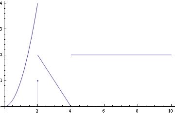
To show the discrete value at t=2, we have two options:
pts := ListPlot[{{2, 1}}]
a := Plot[f[t], {t, 0, 10}, PlotRange -> Full]
Show[a, pts]
Show[a, dp]
II. Plotting
The solution to an initial value problem can be plotted as follows
a = DSolve[{y'[x] == -2 x y[x], y[0] ==1}, y[x],x];
Plot[y[x] /.a, {x,-2,2}]
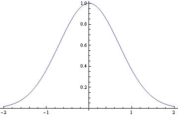
In this command sequence, I am first defining the differential equation that I want to solve. In this line, I define the equation and the initial condition as well as the independent and dependent variables.
In the second line, I am commanding Mathematica to evaluate the given differential equation and plot its result. I then command Mathematica to solve the equation and plot the given result of the initial value problem for the range listed above. Typing these two commands together allows Mathematica to solve the initial value problem for you and to graph the initial value problem's solution.
If you need to plot a sequence of solutions with different initial conditions, one can use the following script:
IC = {{0.5, 0.7}, {0.5, 4}, {0.5, 1}};
Do[ansODE[i] =
Flatten[DSolve[{myODE, y[IC[[i, 1]]] == IC[[i, 2]]}, y[t], t]];
myplot[i] = Plot[Evaluate[y[t] /. ansODE[i]], {t, 0.02, 5}];
Print[myplot[i]]; , {i, 1, Length[IC]}]
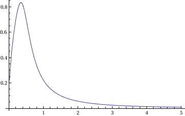
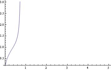
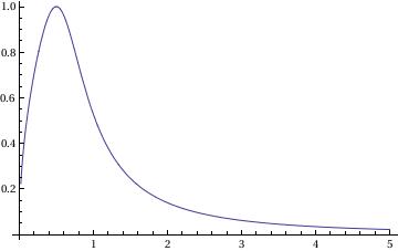
In this command, you define the differential equation that you want to solve and the initial conditions (the respective x and y values). Flattening creates a list of the equations. Then you are asking Mathematica to evaluate the different equations according to their different initial conditions.
Finally, the Print command tells Mathematica to plot the graphs and the size that you want the lines on the graphs to be.
When you enter these commands, you may receive a line saying that some of the branches lead to empty solutions, but this just means that DSolve cannot find a unique solution for part of the equation. However, this does not appear to affect the final graph.
To plot a family of solutions:
samples1 = Table[f1[x], {c, -20/3, 8, 1}]
Plot[Evaluate[samples1], {x, -3, 3}, PlotStyle -> {Black}]
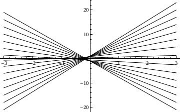
In this command, I am plotting a family of solutions to a differential equation. This command is not really any different from a normal plot command. The primary difference is that I have created a list of samples in a table. These samples have the variable c and then I can plug in different values of c to create the values in this table. This means that I am asking Mathematica to plot solutions with different values of the differential constant c. This command will plot a variety of different graphs over the range of c. The command on the second line also yields the different members of this family of equations associated with each value of c.
I can further complicate this problem by plotting a family of solutions to a differential equation along with the singular solution of the Initial Value Problem y' = 2sqrt(y), y(0)=0. To do this, use the following Mathematica code.
q2 = Plot[y = x^2, {x, -3.5, 3.5}, PlotStyle -> Thick]
Show[q2, q1]
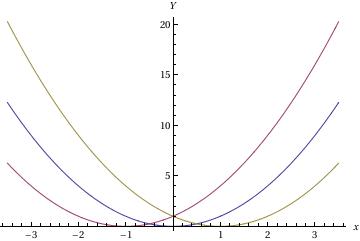
In this sequence of command, I am first entering the family of differential equations. Since I entered three values of C[1] I will get three graphs, each will be a different color. Then the second command will graph the solution to the initial value problem. By making this line thick, it will be easier for me to distinguish it. The final command graphs all of these curves on one graph.
Plot sine function downward:
ListLinePlot[data1, PlotRange -> All];
ticks = Table[{-x, x}, {x, -5, 5, .2}];
ListLinePlot[{#, -#2} & @@@ data1, PlotRange -> {All, 1}, Ticks -> {All, ticks}, Axes -> True, PlotStyle -> Thick]
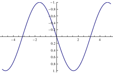
ListLinePlot[data1, PlotRange -> All];
ticks = Table[{-x, x}, {x, -5, 5, .2}];
ListLinePlot[{#, -#2} & @@@ data1, PlotRange -> {-1.3, 1.3},
Ticks -> {All, ticks}, Frame -> False, PlotRange -> All,
Epilog -> {Text["x", {5.5, 0}], Text["y", {0, -1.4}]},
PlotRangeClipping -> False, ImagePadding -> {{20, 20}, {20, 20}}]
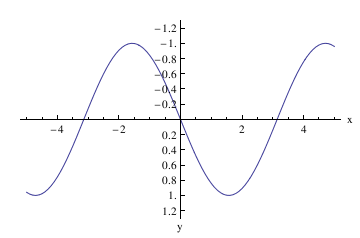
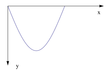
Now plot with arrows, but without units:
Graphics[Join[{Arrowheads[a]},
Arrow[{{0, 0}, #}] & /@ {{x, 0}, {0, y}}, {Text[
Style["x", FontSize -> Scaled[f]], {0.95*x, 0.1*y}],
Text[Style["y", FontSize -> Scaled[f]], {0.1 x, 1*y}]}]]
ListLinePlot[data1, PlotRange -> All];
ticks = Table[{-x, x}, {x, -5, 5, .2}];
Show[ListLinePlot[{#, -#2} & @@@ data1, PlotRange -> {-1.3, 0},
Ticks -> {None, None}, Frame -> False, PlotRange -> All,
PlotRangeClipping -> False, ImagePadding -> {{20, 20}, {20, 20}}],
axes[5.3, -1.33, .06, .05], Axes -> False]
Example. Tractrix (from the Latin verb trahere "pull, drag"; plural: tractrices) is the curve along which an object moves, under the influence of friction, when pulled on a horizontal plane by a line segment attached to a tractor (pulling) point that moves at a right angle to the initial line between the object and the puller at an infinitesimal speed. By associating the object with a dog, the string with a leash, and the pull along a horizontal line with the dog's master, the curve has the descriptive name hundkurve (dog curve) in German. It is therefore a curve of pursuit. It was first introduced by Claude Perrault (1613 -- 1688) in 1670. Trained as a physician, Claude was invited in 1666 to become a founding member of the French Academie des Sciences, where he earned a reputation as an anatomist. The first known solution was given by Christian Huygens (1692), who also named the curve the tractrix. Its parametric equation is
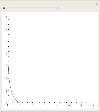
To plot tractrix curve, we use the following code:
Manipulate[
ParametricPlot[tractrix[a][t] // Evaluate, {t, 0, .99*\[Pi]},
PlotRange -> {0, 7}], {a, 1, 6}]
Export["tractrix1.gif",%]
Plot[y'[x] = -Sqrt[a^2 - x^2]/x, {x, 0, 20},
PlotRange -> {-10, 10}], {a, 0, 20}]
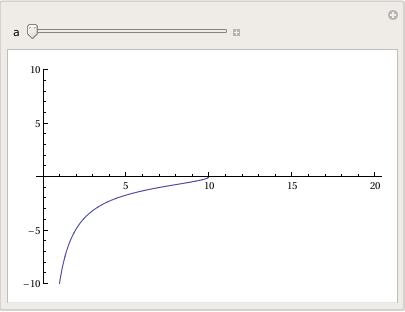
a Log[x] + a Log[a^2 + a Sqrt[a^2 - x^2]]]}}
Plot[-Sqrt[a^2 - x^2] + a Log[a] - a Log[a^2] - a Log[x] + a Log[a^2 + a Sqrt[a^2 - x^2]], {x, 0, 20}, PlotRange -> All], {a, 1, 20}]
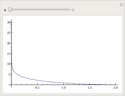
Example. Cycloid
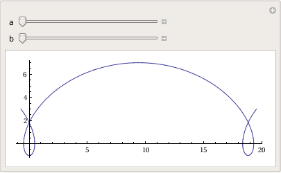
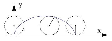
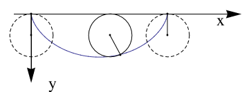
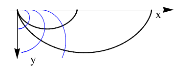
A cycloid is the curve traced by a point on the rim of a circular wheel e of radius a rolling along a straight line. It was studied and named by Galileo in 1599. Its curve can be generalized by choosing a point not on the rim, but at any distance b from the center on a fixed radius. If b=a, we get a usual cycloid.
The Parametrization of the cycloid can be made through the following equations:
Manipulate[
ParametricPlot[
cycloid[a, b][t] // Evaluate, {t, -\[Pi]/2, 5*\[Pi]/2}], {a, 1, 5}, {b, 1, 5}]
axes[x_, y_, f_, a_] :=
Graphics[Join[{Arrowheads[a]},
Arrow[{{0, 0}, #}] & /@ {{x, 0}, {0, y}}, {Text[
Style["x", FontSize -> Scaled[f]], {0.9*x, .15*y}],
Text[Style["y", FontSize -> Scaled[f]], {0.07 x, 1*y}]}]]
data1 = Table[{t, cycloid[1, 1][t][[1]], cycloid[1, 1][t][[2]]}, {t,
0, 2 \[Pi], 0.01}];
Show[ListLinePlot[{#2, #3} & @@@ data1,
PlotRange -> {{-\[Pi]/4, 3 \[Pi]}, {0, 3}},
AspectRatio -> Automatic, Ticks -> {None, None}, Frame -> False,
PlotRange -> All, PlotRangeClipping -> False,
ImagePadding -> {{20, 20}, {20, 20}}], axes[9.7, 3.2, .07, .07],
Graphics[{{Dashed, Circle[{0, 1}, 1]}, Point[{\[Pi] + .5, 1}],
Point[{4.123, 1.9}], Circle[{\[Pi] + .5, 1}, 1],
Line[{{0, 0}, {0, 1}}], Point[{0, 0}], Point[{\[Pi]*2, 1}],
Point[{\[Pi]*2, 0}],
Point[{0, 1}], {Dashed, Circle[{\[Pi]*2, 1}, 1]},
Line[{{\[Pi]*2, 0}, {\[Pi]*2, 1}}],
Line[{{\[Pi] + .5, 1}, {4.123, 1.9}}]}]]
Now we plot cycloid downward:
Graphics[Join[{Arrowheads[a]},
Arrow[{{0, 0}, #}] & /@ {{x, 0}, {0, y}}, {Text[
Style["x", FontSize -> Scaled[f]], {0.9*x, .08*y}],
Text[Style["y", FontSize -> Scaled[f]], {0.1 x, 1*y}]}]]
data1 = Table[{t, cycloid[1, 1][t][[1]], cycloid[1, 1][t][[2]]}, {t,
0, 2 \[Pi], 0.01}];
Show[ListLinePlot[{#2, -#3} & @@@ data1,
PlotRange -> {{-\[Pi]/4, 3 \[Pi]}, {-3, 0}},
AspectRatio -> Automatic, Ticks -> {None, None}, Frame -> False,
PlotRange -> All, PlotRangeClipping -> False,
ImagePadding -> {{20, 20}, {20, 20}}], axes[9.7, -3.2, .07, .07],
Graphics[{{Dashed, Circle[{0, -1}, 1]}, Point[{\[Pi] + .5, -1}],
Point[{4.123, -1.9}], Circle[{\[Pi] + .5, -1}, 1],
Line[{{0, 0}, {0, -1}}], Point[{0, 0}], Point[{\[Pi]*2, -1}],
Point[{\[Pi]*2, 0}],
Point[{0, -1}], {Dashed, Circle[{\[Pi]*2, -1}, 1]},
Line[{{\[Pi]*2, 0}, {\[Pi]*2, -1}}],
Line[{{\[Pi] + .5, -1}, {4.123, -1.9}}]}]]
Graphics[Join[{Arrowheads[a]},
Arrow[{{0, 0}, #}] & /@ {{x, 0}, {0, y}}, {Text[
Style["x", FontSize -> Scaled[f]], {0.9*x, .08*y}],
Text[Style["y", FontSize -> Scaled[f]], {0.1 x, 1*y}]}]]
data1 = Table[{\[Tau], Cycloid[1, \[Tau]][[1]],
Cycloid[1, \[Tau]][[2]]}, {\[Tau], 0, 2 \[Pi], 0.01}];
data2 = Table[{\[Tau], Cycloid[1.5, \[Tau]][[1]],
Cycloid[1.5, \[Tau]][[2]]}, {\[Tau], 0, 3.14^2 - 0.6, 0.01}];
data1a = Table[{\[Rho], Cycloid[\[Rho], 2][[1]],
Cycloid[\[Rho], 2][[2]]}, {\[Rho], .3, 10, .01}];
data2a = Table[{\[Rho], Cycloid[\[Rho], 3][[1]],
Cycloid[\[Rho], 3][[2]]}, {\[Rho], .5, 10, .01}];
data3a = Table[{\[Rho], Cycloid[\[Rho], 4][[1]],
Cycloid[\[Rho], 4][[2]]}, {\[Rho], .65, 10, .01}];
Show[ListLinePlot[{#2, -#3} & @@@ data1, AspectRatio -> Automatic,
PlotRange -> {{-\[Pi]/4, 5*\[Pi]}, {-5, 0}},
PlotStyle -> {Black, Thick}, Ticks -> {None, None}, Frame -> False,
PlotRange -> All, PlotRangeClipping -> False,
ImagePadding -> {{20, 20}, {20, 20}}],
ListLinePlot[{#2, -#3} & @@@ data2, PlotStyle -> {Black, Thick},
PlotRange -> {{-\[Pi]/4, 2*\[Pi] + \[Pi]/4}, {-5, 0}},
Ticks -> {None, None}, Frame -> False, PlotRange -> All,
PlotRangeClipping -> False, ImagePadding -> {{20, 20}, {20, 20}}],
ListLinePlot[{#2, -#3} & @@@ data1a,
PlotRange -> {{-\[Pi]/4, 2*\[Pi] + \[Pi]/4}, {-5, 0}},
Ticks -> {None, None}, Frame -> False, PlotRange -> All,
PlotStyle -> {Blue}, PlotRangeClipping -> False,
ImagePadding -> {{20, 20}, {20, 20}}],
ListLinePlot[{#2, -#3} & @@@ data2a,
PlotRange -> {{-\[Pi]/4, 2*\[Pi] + \[Pi]/4}, {-5, 0}},
Ticks -> {None, None}, Frame -> False, PlotRange -> All,
PlotStyle -> {Blue}, PlotRangeClipping -> False,
ImagePadding -> {{20, 20}, {20, 20}}],
ListLinePlot[{#2, -#3} & @@@ data3a,
PlotRange -> {{-\[Pi]/4, 2*\[Pi] + \[Pi]/4}, {-5, 0}},
Ticks -> {None, None}, Frame -> False, PlotStyle -> {Blue},
PlotRange -> All, PlotRangeClipping -> False,
ImagePadding -> {{20, 20}, {20, 20}}], axes[16.5, -5.2, .07, .07]]
You can use a variety of different plot functions to make graphs. In this command, I will introduce you to contour plot. The contour plot command gives a contour diagram similar to a topographical map for a function.
PlotRange -> {{-2, 2}, {-4, 4}}, AspectRatio -> 1.5/2.1,
ContourStyle-> {Green , Thickness[0.005]},
FrameLabel -> {"x", "y"}, RotateLabel -> False] (* Thickness is .5% of the figure's length *)
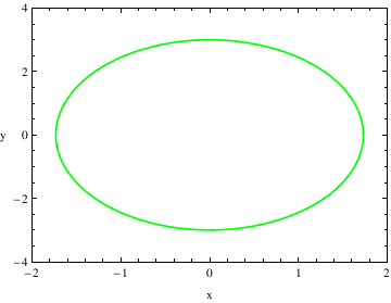
After I entered the ContourPlot command, I used a variety of different commands to modify the graph and create a more aesthetically pleasing graph. When you add the added details for plotting, you do not close the ContourPlot command until all of the adjustments have been made.
PlotRange tells me the range that I want to plot. This is different from the x and y ranges before it because those numbers give the ranges that should be used to solve the given equation.
AspectRatio tells me the ratio between the height and the width of the graph. This describes how you want to scale the x-axis and y-axis to look in comparison with one another.
ContourStyle describes how you want the lines of the contour plot to look.
This command can also be used to change the color of the graph. If you do this, you need to add a second command with ContourStyle like I did above. For the Thickness command, this describes the percent thickness you want of the line, I have it set at .5% of the figure's length.
FrameLabel tells me what I want to be placed on the borders of the graph. For example, if I was graphing a Potential Energy Function, I could set the vertical frame to say U(x) and the horizontal frame to say x.
RotateLabel tells me whether or not I want to rotate the label that I designated using the FrameLabel Command.
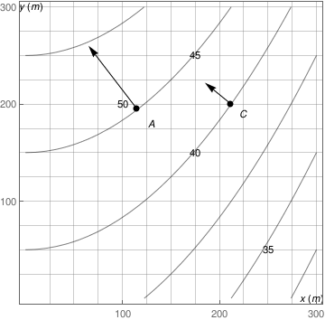
j=Graphics[{{PointSize[Large], Black, Point[{{115,195},{212,200}}]}, Inset["A", {130,180}], Inset["C", {225,190}], Inset["y(m)", {6,301}], Inset["x(m)", {295,0}], Inset["50", {100,200}], Inset["45", {175,250}], Inset["40", {175, 150}], Inset["35", {250,50}]}]
k= Graphics[Arrow[{{115,195}, {65,260}}]]
l= Graphics[Arrow[{{212,200}, {185,222}}]]
Show[i, j, k, l]
For plotting a function with a point discontinuity, Mathematica will generate a vertical line at the point discontinuity to represent that the value at x=1 goes to infinity.
When you are graphing these kinds of functions, often times, it can be useful to generate a vertical or horizontal asymptote. To do this, you can use the following commands:
Plot[c,{x,c1,c2}] for horizontal asymptotes. In this command, c is the value of the horizontal asymptote and c1 and c2 are the range of the graph.
It is more difficult to graph a vertical line using Mathematica than a horizontal line. One way to do this is:
In this command sequence, I am telling Mathematica to graph the image x=2 so I just get the vertical line. The range of this function is 1 to 3. Then the command calls for Mathematica to create a straight vertical gridline at x=2. None is part of the command that tells Mathematica to just make it a straight dark, non dashed line.
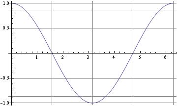
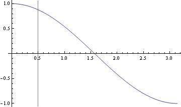
If you're actually using Plot (or ListPlot, etc.), the easiest solution is to use the GridLines option,
which lets you specify the x- and y-values where you want the lines drawn.
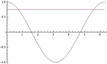
For the case of horizontal lines when using Plot the easiest trick is to just include additional constant functions
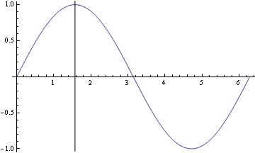
For vertical lines, there's the Epilog option for Plot and ListPlot:
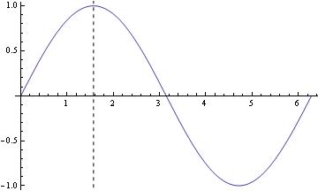
Another, perhaps even easier, option would be using GridLines:
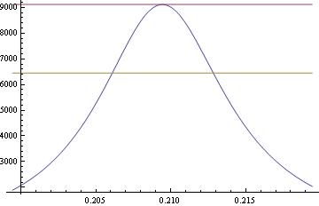
f[x_] := (x^2 z)/((x^2 - y^2)^2 + 4 q^2 x^2) /. {y -> \[Pi]/15, z -> 1, q -> \[Pi]/600}
Plot[{f[x], f[\[Pi]/15],f[\[Pi]/15]/Sqrt[2]}, {x, \[Pi]/15 - .01, \[Pi]/15 + .01}]
V. Plotting with axes, without axes
There are times when the axes could interfere with displaying certain functions and solutions to ODEs. Fortunately, getting rid of axes in recent versions of Mathematica is very easy.
One method of specifying axes is to use the above options, but there is also a visual method of changing axes.
VI. Changing variables
Changing variables:
Example.
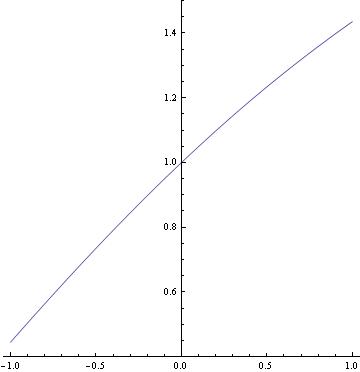
Here is the solution to the inverse problem:
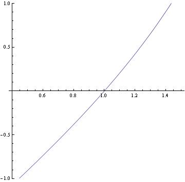
Here is a way to flip the above graph:
As you can see, you can practically plot any implicit function using the implicitplot command. Explicit functions can be plotted using the regular plot command.
2 Sin[t]}, {Cos[t], Sin[t]}}, {t, 0, 2 Pi},
PlotStyle -> {Dashed, Dashing[Tiny], Directive[Thick, Green], Black}]
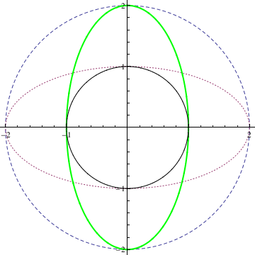
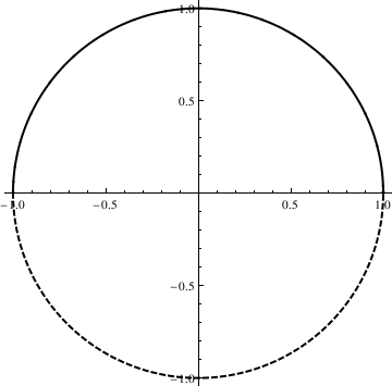
We can also plot a circle or ellipse using the following commands:
Circle[{x,y},r] gives a circle of radius r centered at {x,y}.
Circle[{x,y}] represents a circle of radius 1.
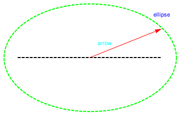
Circle[{x,y},{r_x , r_y}] gives an axis-aligned ellipse with semi-axes length r_x and r_y.
Circle[{x,y},..., {theta_1 , theta_2}] gives a a circular or ellipse arc from angle theta_1 to theta_2
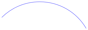
a = Graphics[{Red, Arrow[{{1, 2}, {2, 2.4}}], {Cyan, Text[arrow, {1.2, 2.2}]}}]
Show[R, a]
When one wants to plot a figure that is built from stright lines, it can be donce as follows
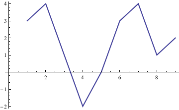
A directed graph can be plotted as well
With[{q = Pi/6},
Graphics[{Circle[{0, 0}, 1, {q, 2 Pi - q}],
Arrowheads[{{.05, .8}}],
Arrow[{{Cos[q] + 2, Sin[q]}, {Cos[q], Sin[q]}}],
Arrow[{{Cos[q], Sin[-q]}, {Cos[q] + 2, Sin[-q]}}],
FontSize -> Medium, Text["\[ScriptCapitalC]", {2, Sin[q]}, {0, -2}]},
Axes -> True, PlotRange -> {{-4, 6}, {-2, 2}}]]
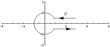
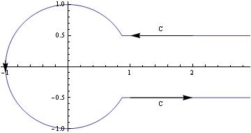
If you want the actual function for contour, then maybe something like the following:
contour[t_, t0_: (5 Pi/6)] := Piecewise[{ {Exp[I (t + Pi)], -t0 < t < t0},
{t - t0 + Exp[I (t0 + Pi)], t >= t0}, {-t - t0 + Exp[-I (t0 + Pi)], t <= -t0}}]
ParametricPlot[Through[{Re, Im}[contour[t]]], {t, -8, 8}, PlotPoints -> 30]

Another option:
c = 0.5;
t0 = ArcSin[c];
PolarPlot[If[Abs[t] < t0, Abs[Sin[t0]/Sin[t]], 1], {t, -\[Pi], \[Pi]},
Epilog -> { Arrow[{{2, c}, {1, c}}], Arrow[{{1, -c}, {2, -c}}], Arrow[{{-1, .1}, {-1, -.1}}],
Text["C", {1.5, c + .1}], Text["C", {1.5, -(c + .1)}] }]
Label lines:
To see the equation of the line when cursor reaches the graph, use Tooltip command:
Plot[Tooltip[Sin[x]], {x, 0, 8 Pi}]
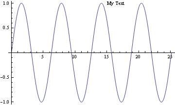
To put text/title on the picture, use Epilog command:
Plot[Sin[x], {x, 0, 8 Pi}, Epilog -> Text["My Text", Offset[{32, 0}, {14, Sin[14]}]]]
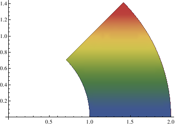
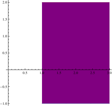
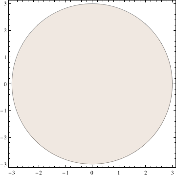
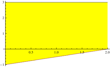
1.1.6. Plots with Filling
We repeat the previous example with filling:
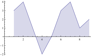
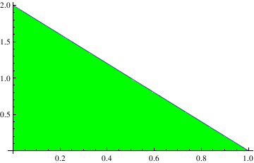
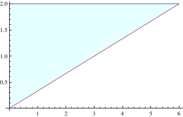
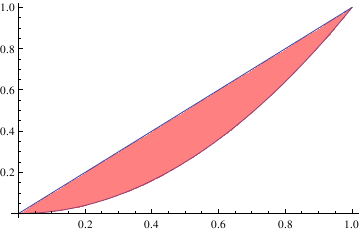
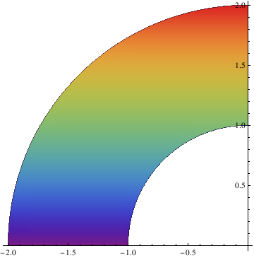
Filling -> Axis, FillingStyle -> Blue, Axes -> True, AxesStyle -> Directive[Thick]]
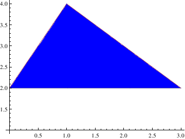
a = Graphics[{{Opacity[0], White, tr[[1]]}, GeometricTransformation[{Opacity[1], Blue, tr[[1]]}, TranslationTransform[{0, 1}]]}]
Show[a, Axes -> True, AxesStyle -> Black, AspectRatio -> 0.75]
I. Venn Diagrams
Filling circles can be plotted using Graphics cammand. Graphics are represented as symbolic expressions, using
either"directives" or "styles":
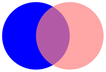
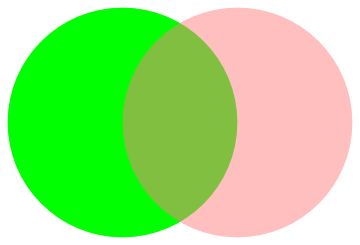
We can plot Venn diagrams using the following subroutine
VennDiagram2[n_, ineqs_: {}] :=
Module[{i, r = .6, R = 1, v, grouprules, x, y, x1, x2, y1, y2, ve},
v = Table[Circle[r {Cos[#], Sin[#]} &[2 Pi (i - 1)/n], R], {i, n}];
{x1, x2} = {Min[#], Max[#]} &[
Flatten@Replace[v,
Circle[{xx_, yy_}, rr_] :> {xx - rr, xx + rr}, {1}]];
{y1, y2} = {Min[#], Max[#]} &[
Flatten@Replace[v,
Circle[{xx_, yy_}, rr_] :> {yy - rr, yy + rr}, {1}]];
ve[x_, y_, i_] :=
v[[i]] /. Circle[{xx_, yy_}, rr_] :> (x - xx)^2 + (y - yy)^2 < rr^2;
grouprules[x_, y_] =
ineqs /.
Table[With[{is = i}, Subscript[_, is] :> ve[x, y, is]], {i, n}];
Show[If[MatchQ[ineqs, {} | False], {},
RegionPlot[grouprules[x, y], {x, x1, x2}, {y, y1, y2},
Axes -> False]],
Graphics[v],
PlotLabel ->
TraditionalForm[Replace[ineqs, {} | False -> \[EmptySet]]],
Frame -> False]]
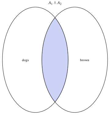
a12 = VennDiagram2[2, Subscript[A, 1] && Subscript[A, 2]]
a1 = Graphics[Text[dogs, {-0.9, 0}]]
b1 = Graphics[Text[brown, {0.9, 0}]]
Show[a12, a1, b1]
or
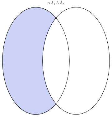
a32 = VennDiagram2[2, Not[Subscript[A, 1]] && Subscript[A, 2]]
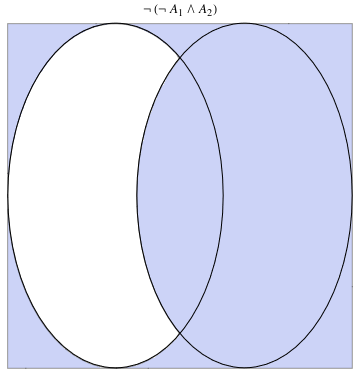
a33 = VennDiagram2[2, Not[Not[Subscript[A, 1]] && Subscript[A, 2]]]
 |
 |
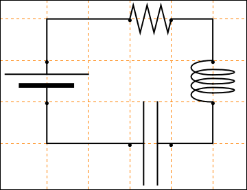
1.1.7. Electric Circuits
display[Table[rcElement // at[{i, 0}], {i, 0, 17, 3}]]
(* The following line adds a connecting wire for a list of points within a framework defined by the Map. The Map is defined by the text and point list. The Text is defined by the Style. *)
connect[pointList_] := {Line[pointList], Map[Text[Style["", FontSize -> 18]] &, pointList[[{1, -1}]]]}
(*The following segment of code is to instantiate each of the elements that will be used in the circuit. If you wanted to include a
switch or any other new element, this would be the section to add it.*)
gap[l_: 1] := Line[l {{{0, 0}, {1/3, 0}}, {{2/3, 0}, {1, 0}}}]
resistor[l_: 1, n_: 3] :=
Line[Table[{i l/(4 n), 1/3 Sin[i Pi/2]}, {i, 0, 4 n}]]
coil[l_: 1, n_: 3] := Module[{
scale = l/(5/16 n + 1/2),
pts = {{0, 0}, {0, 1}, {1/2, 1}, {1/2, 0}, {1/2, -1}, {5/
16, -1}, {5/16, 0}} },
Append[Table[BezierCurve[scale Map[{d 5/16, 0} + # &, pts]], {d, 0,
n - 1}],
BezierCurve[scale Map[{5/16 n, 0} + # &, pts[[1 ;; 4]]]]]]
(*This portion of the code dictates the specifics of the display of
the circuit. In particular, I have a grid with dotted lines.*)
capacitor[l_: 1] := {gap[l],
Line[l {{{1/3, -1}, {1/3, 1}}, {{2/3, -1}, {2/3, 1}}}]}
battery[l_: 1] := {gap[
l], {Rectangle[l {1/3, -(2/3)}, l {1/3 + 1/9, 2/3}],
Line[l {{2/3, -1}, {2/3, 1}}]}}
contact[l_: 1] := {gap[l],
Map[{EdgeForm[Directive[Thick, Black]], FaceForm[White],
Disk[#, l/30]} &, l {{1/3, 0}, {2/3, 0}}]}
Options[display] = {Frame -> True, FrameTicks -> None,
PlotRange -> All, GridLines -> Automatic,
GridLinesStyle -> Directive[Orange, Dashed],
AspectRatio -> Automatic};
display[d_, opts : OptionsPattern[]] :=
Graphics[Style[d, Thick],
Join[FilterRules[{opts}, Options[Graphics]], Options[display]]]
(*This line sets up the framework for adding components to the
circuit at specific positions.*)
at[position_, angle_: 0][obj_] :=
GeometricTransformation[obj,
Composition[TranslationTransform[position],
RotationTransform[angle]]]
(*This generates the specific circuit, which all prior code was \
designed to allow us to do. This is the only part that needs to be \
changed to alter the circuit, providing no new unique elements need \
to be added.*)
label[s_String, color_: RGBColor[.3, .5, .8]] :=
Text@Style[s, FontColor -> color, FontFamily -> "Geneva",
FontSize -> Large];
display[{
battery[] // at[{0, 0}, Pi/2],
connect[{{0, 1}, {0, 2}, {2, 2}}],
resistor[] // at[{2, 2}],
connect[{{3, 2}, {4, 2}, {4, 1}}],
coil[] // at[{4, 0}, Pi/2],
connect[{{4, 0}, {4, -1}, {3, -1}}],
capacitor[] // at[{2, -1}],
connect[{{2, -1}, {0, -1}, {0, 0}}]}]
1.1.8. Labeling Figures
VIII. Labeling Figures
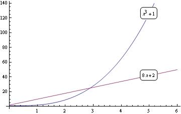
To write labels on the graph:
fns[x_] := {1 + x^3, 2 + 8*x};
len := Length[fns[x]];
Plot[Evaluate[fns[x]], {x, 0, 6}, Epilog ->
Table[Inset[
Framed[DisplayForm[fns[x][[i]]], RoundingRadius -> 5], {5,
fns[5][[i]]}, Background -> White], {i, len}]]
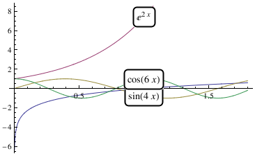
You can do something similar with Locators that allows you to move the labels wherever you want:
fns[x_] := {Log[x], Exp[2*x], Sin[4*x], Cos[6*x]};
DynamicModule[{pos = Table[{1, fns[1][[i]]}, {i, len}]},
LocatorPane[Dynamic[pos], Plot[Evaluate[fns[x]], {x, 0, 1.8}],
Appearance ->
Table[Framed[Text@TraditionalForm[fns[x][[i]]],
RoundingRadius -> 5, Background -> White], {i, len}]]]
Export["label2.png",%]
1.1.9. Polar plot
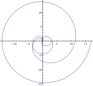
Cycloid
The Parametrization
Manipulate[
ParametricPlot[
cycloid[a, b][t] // Evaluate, {t, -\[Pi]/2, 5*\[Pi]/2}], {a, 1, 5}, {b, 1, 5}]
PolarPlot[Cycloid[1.5,theta],{theta, 0, 4*Pi}]
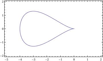
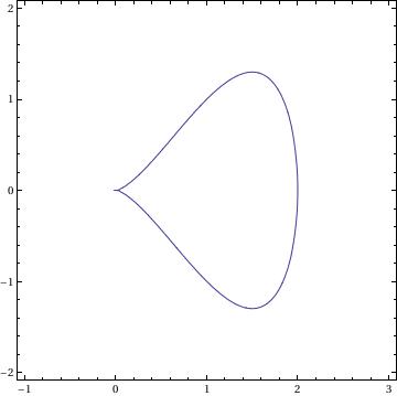
Antiversiera
For two values of parameters:
a=-2; b=1;
and
a = 1; b = 2;
we have two graphs:
Arachnida
PolarPlot[ 2*a*Sin[n*\[Phi]]/Sin[(n - 1)*\[Phi]], {\[Phi], .0001, 2*\[Pi]}]
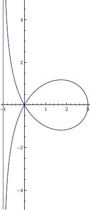
Astroid
ContourPlot[(x^2 + y^2 - t^2)^3 + 27*x^2*y^2 == 0, {x, -5, 5}, {y, -5, 5}]
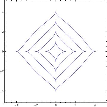
Besace
ContourPlot[(x^2 - b*y)^2 + a^2*(y^2 - x^2) == 0, {x, -5, 5}, {y, -1.5, 4.5}, AspectRatio -> Automatic]
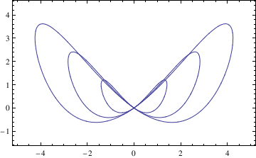
Bifolium
ContourPlot[(x^2 + y^2)^2 == b*x^2*y, {x, -1, 1}, {y, -0.2, 1}, AspectRatio -> Automatic]
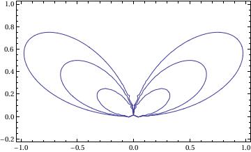
Cardioid
PolarPlot[2*r*(1 - Cos[\[Phi]]), {\[Phi], 0, 2*\[Pi]}, AspectRatio -> Automatic]
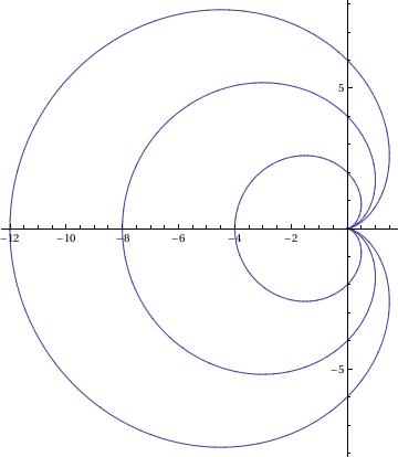
Circular Tractrix
f[r_, th_] := th - ArcTan[Sqrt[4*a^2 - r^2]/r] - Sqrt[4*a^2 - r^2]/r
g[r_, th_] := {r Cos[th], r Sin[th]}
pl = ContourPlot[f[r, th] == 0, {r, 0, 8 Pi}, {th, 0, 4 Pi}, PlotPoints -> 30];
pl[[1, 1]] = g @@@ pl[[1, 1]];
Show[pl, PlotRange -> All, AspectRatio -> 1.5/2]
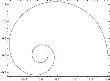
Cramer
ContourPlot[ x*(x^2 + y^2) == (r + l)*x^2 - (r - l)*y^2, {x, -1, 5}, {y, -5, 5}, AspectRatio -> 1]
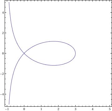
Epicycloid
PolarPlot[Sqrt[ R^2 + h^2 - 2*(R + r)*h*Cos[R/r*\[Phi]]], {\[Phi], 0, 200*\[Pi]}]
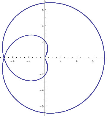
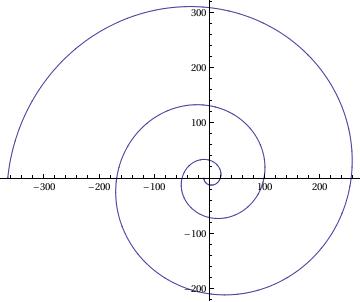
Galileo's Spiral
PolarPlot[a*\[Phi]^2 - l, {\[Phi], 0, 6*\[Pi]}]
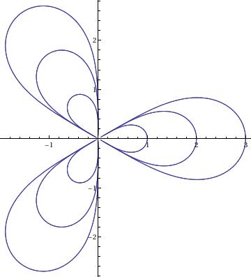
Kiepert
PolarPlot[(l^3*Cos[3*\[Phi]])^(1/3), {\[Phi], -2*\[Pi], 2*\[Pi]}]
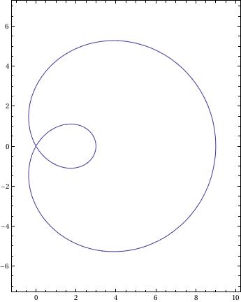
Limacon
ContourPlot[(x^2 + y^2 - 2*a*x)^2 == l^2*(x^2 + y^2), {x, -1,
10}, {y, -7, 7}, AspectRatio -> 14/11]
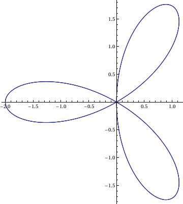
Rose
PolarPlot[a*Cos[k*\[Phi]], {\[Phi], 0, 4*\[Pi]}]
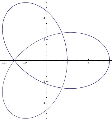
Trefoil
ParametricPlot[{r*(2*Cos[2*t] - Cos[t]), r*(2*Sin[2*t] + Sin[t])}, {t, 0, 10}]
1.9 References
Martha L. Abell, James P. Braselton
Differential Equations With Mathematica,
Academic Press, 2004
ISBN 0120415623, 978012041562
Alfred Gray, Mike Mezzino, and Mark Pinsky
Introduction to Ordinary Differential Equations with Mathematica: An Integrated Multimedia Approach
Springer
ISBN-10: 0387944818 | ISBN-13: 978-0387944814
Brian R. Hunt, Ronald L. Lipsman, John E. Osborn, Donald A. Outing, Jonathan Rosenberg
Differential Equations with Mathematica, 3rd Edition
ISBN: 978-0-471-77316-0
Clay C. Ross
Differential Equations
An introduction with Mathematica
Springer-Verlag, 1995
ISBN: 0-387-94301-3
Return to Mathematica page
Return to the main page (APMA0330)
Return to the Part 2 (First Order ODEs)
Return to the Part 3 (Numerical Methods)
Return to the Part 4 (Second and Higher Order ODEs)
Return to the Part 5 (Laplace Transform)
